The Psychology of Colour in Retail Design
- Kayleigh Martin

- May 6, 2024
- 2 min read
Color is a powerful tool in the arsenal of any graphic designer, especially when it comes to retail environments. From storefronts to product packaging, the colours we choose can have a significant impact on how customers perceive a brand and ultimately influence their purchasing decisions. Understanding the psychology of colour is essential for creating retail designs that resonate with consumers on a deeper level.
The Emotional Impact of Color
Different colours evoke different emotions and associations, which can directly influence consumer behaviour. Here are some common associations with popular colours:
Red: Associated with passion, excitement, and urgency, red is often used to create a sense of urgency or stimulate appetite, making it a popular choice for food and beverage brands.
Blue: Symbolising trust, reliability, and calmness, blue is frequently used by banks, tech companies, and healthcare brands to instill a sense of security and professionalism.
Yellow: Associated with optimism, warmth, and energy, yellow is often used to grab attention and convey a sense of friendliness, making it a popular choice for retail signage and promotions.
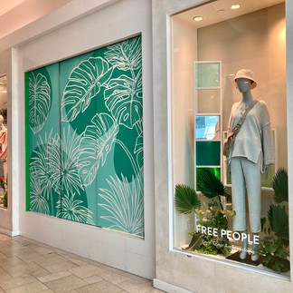
Green: Symbolising growth, harmony, and nature, green is commonly used by eco-friendly and organic brands to convey sustainability and freshness.
Purple: Associated with luxury, creativity, and spirituality, purple is often used by beauty and cosmetic brands to evoke a sense of elegance and sophistication.


Practical Tips for Retail Designers
When choosing colours for retail design, it's crucial to consider both the brand's identity and the target audience. Here are some practical tips to keep in mind:
Understand Your Brand: Consider the brand's values, personality, and target market. Choose colours that reflect these attributes and resonate with the intended audience.
Consider Cultural Differences: Be mindful of cultural associations with colours. What may be perceived positively in one culture could have negative connotations in another.
Use Contrast Wisely: Contrast can help draw attention to important elements and create visual interest. However, be careful not to overdo it, as too much contrast can be overwhelming.
Test and Iterate: Don't be afraid to experiment with different colour combinations and gather feedback from target customers. A/B testing can help determine which colours resonate best with your audience.
Stay Consistent Across Channels: Maintain consistency in colour usage across all touch points, including storefronts, signage, packaging, and digital platforms. This helps reinforce brand recognition and trust.
By understanding the psychology of colour and applying it strategically in retail design, graphic designers can create compelling visual experiences that capture the attention of consumers and drive sales.
Colour is more than just a visual element – it's a powerful tool that can shape perception and influence behaviour. By harnessing the psychological effects of color, graphic designers can create retail designs that not only look great but also resonate with customers on a subconscious level.


Comments